Last updated: September 27th, 2022 at 12:03 UTC+02:00
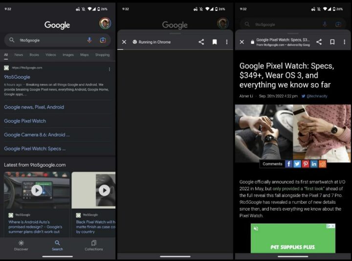
There is an interesting change being reported by a bunch of Pixel owners in Google Search and Discover apps on Android. Apparently, websites now do not open in fullscreen. Instead of going fullscreen, the app now opens recommended articles in a sheet, which you can collapse by swiping down from the top.
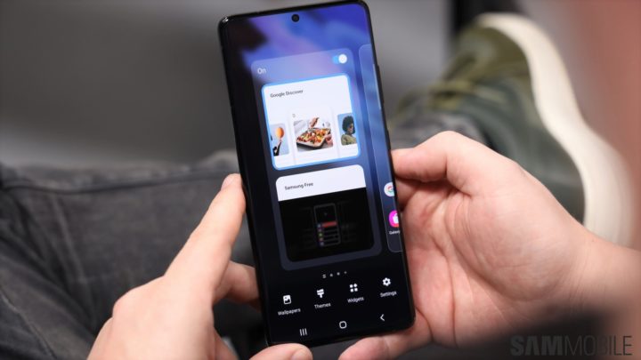
As reported by Pixel owners (via 9To5Google), when you click on any article in the Google Discover feed, the website will open in a sheet, which is still a Chrome custom tab. This also reminds you that it is Google Chrome that is running on top until the page fully loads. This new design could soon come to Samsung phones that have the Google Discover option for its leftmost home screen pane.
There is an X button on the top left of the sheet, letting you close the sheet. There are other buttons such as share, save, and the overflow menu at the right to the cross button.
Google Discover’s new design isn’t widely rolled out yet
You can swipe the sheet down by using the pull tab, while doing the reverse would expand the sheet, hiding the background. Although this eats up some of the vertical space, the experience of reading on a tabbed sheet won’t be impactful for many. However, the good thing is that Google Search/Discover is pretty smart itself and understands which content it should open in a sheet and what goes fullscreen.
For example, folks at 9To5Google report that ESPN video automatically opened in fullscreen for a better viewing experience. As already mentioned, a bunch of Pixel owners running Google app v13.37 beta are currently witnessing this change. There is no clarity on how widely the feature is rolled out or whether it is just a part of Google’s A/B test.
Source Credits: Sammobile
